
‘Degree Zero: Drawing at Midcentury’ Review: Sketching a Path Into a New Era
By Eric Gibson
December 5, 2020
Because drawing is more modest in scale and intimate in its mode of address than many of the other forms of contemporary art being shown today, it is easy to overlook or take for granted. Kudos to the Museum of Modern Art, then, for thrusting it into the conversation with “Degree Zero: Drawing at Midcentury.” The show covers the years 1948-61, when in the aftermath of World War II artists felt art itself had to be reinvented from the ground up and chose that most fundamental of processes, drawing, for the task. At every turn “Degree Zero” upends our expectations to tell us something new about what was going on at that time.
The approximately 80 works here were all drawn from MoMA’s collection by Associate Curator Samantha Friedman, the show’s organizer, and have been installed with sufficient space between them to permit safe viewing at close quarters. They were made by artists from Latin America, Asia and Africa in addition to Europe and North America, untilrecently the museum’s almost exclusive focus. So along with MoMA pantheon memberslike Henri Matisse and Jackson Pollock, we encounter the likes of Jean Dubuffet, Willys deCastro, Otto Piene and Yayoi Kusama, as well as names likely to be as new to the generalpublic as they were to me. This broad-gauge approach is nothing less than revelatory,forcing us to think differently about certain exalted reputations as a result.
The show’s theme is poignantly captured in an untitled charcoal and chalk drawing by theFrench abstractionist Hans Hartung from 1960. It consists of closely abutting dark, blackvertical marks of almost uniform length. On the one hand it reads as a kind ofexistentialist manifesto, “I draw, therefore I am.” Yet at the same time, the individualparts seem to be in the process of resolving themselves into an image—art coming intobeing before our eyes.
Among the unforgettable discoveries is Sonja Sekula (1918-1963), who divided her timebetween the U.S. and her native Switzerland, where, the label tells us, she underwenttreatment for mental illness. “The Voyage” (1956) is a jewel-like, ink-and-watercolor workorganized into a loose grid. Each of its panels is a different color and obsessively filledwith a dense web of lines and minuscule circles within which the only recognizable imageis that of a ship. It is a mesmerizing, vertiginous record of the journey through a chargedinterior landscape that demands—and rewards—prolonged, close scrutiny. A pity, then,that it’s hung almost too high to be seen properly.
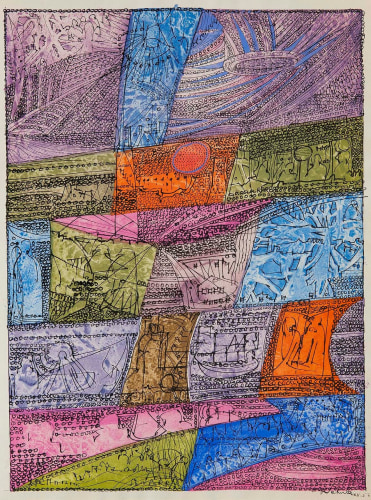
But the artist whose work is most likely to linger in the mind is that of Joong Seop Lee(1916-1956). A refugee during the Korean War who was continually on the move, he“drew” with a sharp-pointed object on the foil from cigarette packages, adding paint tothe incisions. “People Reading the Newspaper (Number 84)” (1950-52), one of three suchworks here, is a semi-abstract image that is as much about the lively, all-over dialogbetween dark lines and colored shapes as it is a group portrait. Adding to the work’simpact is the contrast between its intense pictorial energy and diminutive size—aboutthat of an iPhone screen.
Next to such works, forged in the fire of adversity by individuals for whom art-making wasnothing less than a lifeline, the efforts of the high priests of the New York School can seemslight, even trifling. Jasper Johns’s shadowy image of an American flag looks wanly ho-hum, while the blizzard of lines making up Cy Twombly’s three untitled works comesacross as so much pseudo-Abstract Expressionist posturing. Ellsworth Kelly’s “Study for La Combe II” (1950), a network of diagonal black lines on a white ground derived from theplay of shadows he saw on a stoop, has the feel of a clever design-school project and littlemore.
The only such figure who emerges unscathed is first-generation Abstract ExpressionistFranz Kline. In his collage-drawing “Untitled II” (1952), thick black lines lunge across anow-yellowed page torn from a Brooklyn phone book (“Annlew Louis…Ann&Emily BridalShoppe…Ann Leone Silkscreen Studio…Annable Oliver S”). The thick marks are urgentand authentic, playing off both the page’s flatness and rectangular shape, as well as theunderlying pattern of type.
Aside from the venerable Matisse and Alberto Giacometti, the other artists who shinehere are the Latin Americans. Their work is a live wire newly threaded through MoMA’spermanent collection displays and exhibitions thanks to an enhanced commitment to thisregion in recent years. It enlarges the language of geometric abstraction pioneered byKazimir Malevich and Piet Mondrian in the early 20th century, not only with a new formalinventiveness and rigor—their imagery is much more architectonic—but also, God blessthem, humor. You often encounter witty interplays between figure and ground, twodimensions and three, as in the Brazilian Hércules Barsotti’s “Drawing No. 1 (DesenhoNo.1)” (1958) where one moment its horizontal black spines appear flat on the sheet andin the next to be ballooning out at you like a relief sculpture.
Plan on an unhurried visit to “Degree Zero.” You’re going to want to spend a lot of timewith these drawings—and maybe even come back.
—Mr. Gibson is the Journal’s Arts in Review editor.